


Top 10 Album Covers of 2007
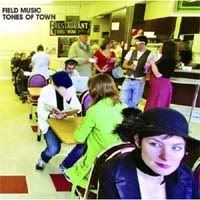
1. Field Music - Tones of Town
The album's theme: "There's no place like home, but how come I don't always feel 'at home', and what does that mean anyway?"
Is the woman in the front of the picture pondering those questions, is the diner her 'home away from home', and does she find it some measure of solace that at least she isn't wearing that lime-green blazer the woman behind her has chosen?
I love the composition in this photo. The guy sitting with lime-blazer woman angles his leg in a way that seems just about right if he was tapping his foot. The picture's posed within an inch of its life, but captures realistic details like that. Not sure I see any food in this diner, mind you, but, hey, it's a stylized pretty image for a band that makes stylized pretty music.

2. The Primary 5 - Go
The cover photo of a traffic signal pole is surprisingly beautiful and, appropriately, it communicates "Go" just about as well as anything, with the arguable exception of an image of one of the games called "Go". A traffic signal is a much more universal image, though.
One possible shortcoming: although the cover works well artistically, the band's name might not be ideally visible from a marketing standpoint. Because the band broke up this month, marketing might not matter much to them at the moment anyway.
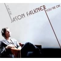
3. Jason Falkner - I'm OK...You're OK
Once an artist decides their photo should grace the cover of their album, the odds of that cover becoming memorable, at least for a positive reason, decline drastically. Playful composition and typography elevate this cover. He's listening to music (or at least pretending to) rather than gazing at the camera or off into a sunset. There's not a terrible eau de ego here, nor does the art seem very likely to quickly look soooo 2007 in a srsly bad way. Granted, the kicky look isn't terribly modern to begin with but I maintain it has a certain timelessness. Zee cover art of I'm OK...You're OK, now and forever.
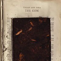
4. Tegan and Sara - The Con
A lovely cover that stood out from the crowd this year and admirably showed an appreciation for another art form. I'm speaking of course, of the noble art of the con. You can read more about cons using the Internet at your local library.
5. Ólafur Arnalds - Eulogy for Evolution
The cover art for this classical album is beautiful and elegant but not overly fussy.
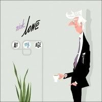
6. Nick Lowe - At My Age
Oh, at what age? (That's a rhetorical question). It would take more than white hair to render Nick Lowe convincingly fuddy-duddy in this wonderful, hep drawing. It's old-fashioned, yes, but in a cool way that fails to make him seem remotely as aged as he might have intended. This artwork reminds me a bit of some of the title credits for old screwball comedies. Lowe, here, is posing a bit like a slightly-stodgy character at the beginning of such a film, right before he's plunged into wacky mishaps.
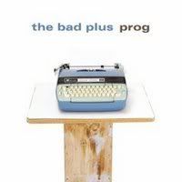
7. The Bad Plus - Prog
a) Here's to words, to writing, to writers!
b) Boo computers! Microsoft sucks! Lets go back!
c) Complicated cover art ‡ better cover art; simple covers can be very effective.
d) All of the Above
e) Some of the Above
f) Boo Multiple Choice Tests; lets go back before they existed!

8. The Most Serene Republic - Population
The Muji "Suburbia in a Bag" toy, made by Industrial Facility was used to create The Most Serene Republic's adorable cover, which looks like a Little Golden Book. Ah, childhood.
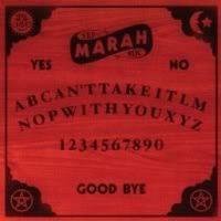
9. Marah - Can't Take It With You EP
The ouija board prompts a double-take; the letters that spell out the title can be found there. Also on the board, the ouija's classic "yes", "no", and "goodbye". This design concept fits the title really well.
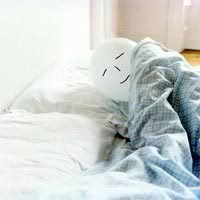
10. Malcolm Middleton - A Brighter Beat
It may provoke a smile, a bit of discomfort, outright hate, or all three, and that's part of what makes this unique cover well-suited to Malcolm Middleton's A Brighter Beat. Among the songs on this album is the one he chose to take a crack at the UK Christmas #1 this year. Now, "We're All Going to Die" may not have been everyone's cuppa, but maybe it was just the title. Or more people decided they'd rather listen to X Factor winner Leon Jackson while drinking their Christmas cuppa. Or maybe Middleton's music really isn't everyone's cuppa. He reminds of us of our mortality, even moreso than television talent programs. (Or do those make us remind ourselves of it, almost with an odd note of reassurance, as in, "well, at least heaven's soundtrack will be better"?) Middleton prompts a strange blend of good cheer and morbid melancholia.
I took an immediate dislike to this cover when I first saw it, but I came to like it, and now I like it a lot. The context the video for "A Brighter Beat" provided must have made a difference. It also helped that the album was released early in the year, so I had several months to get used to the balloon-headed guy in the bed, and come find him quite sweet, if a bit fragile and prone to static cling.
Happy New Year, all. Have a happy and safe 2008!
And regardless of when you're reading this, don't drive if you've had anything alcoholic to drink or be passive about it if you see someone else about to do so.
posted by trill42 | 5:23 PM
![]()
![]()
0 Comments:
Post a Comment
<< Home